Design . Branded . Safety .
Partner Safety - Logo design & branding materials
Scroll down

Logo Design & Branding Materials for Partner Safety
#graphic design
#logo design
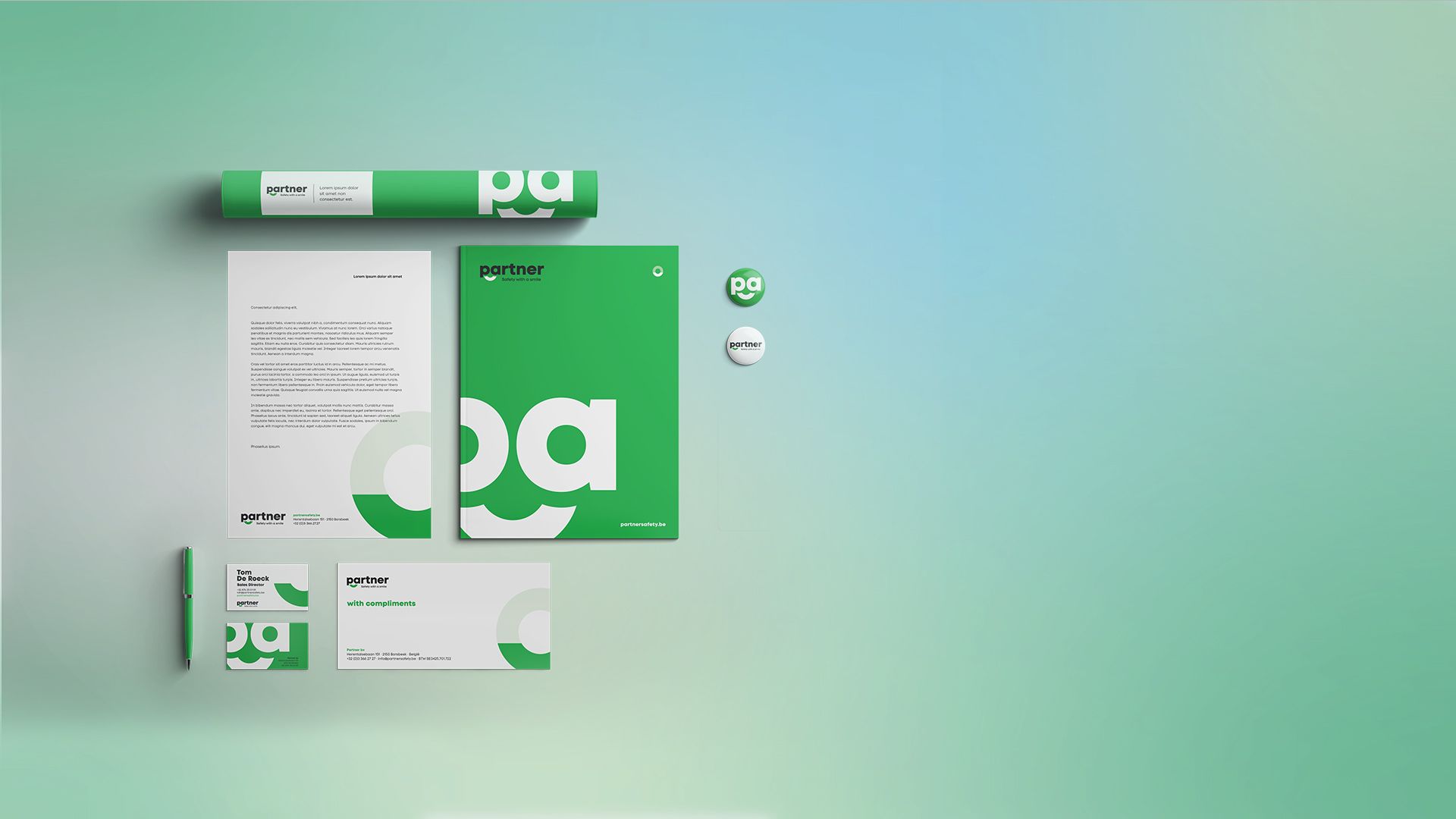
Partner Safety is a family-owned business with a strong focus on workplace safety - and an equally strong belief in personal service. Our challenge was to translate that balance into a clear and trustworthy visual identity: professional and reliable, yet warm and approachable.
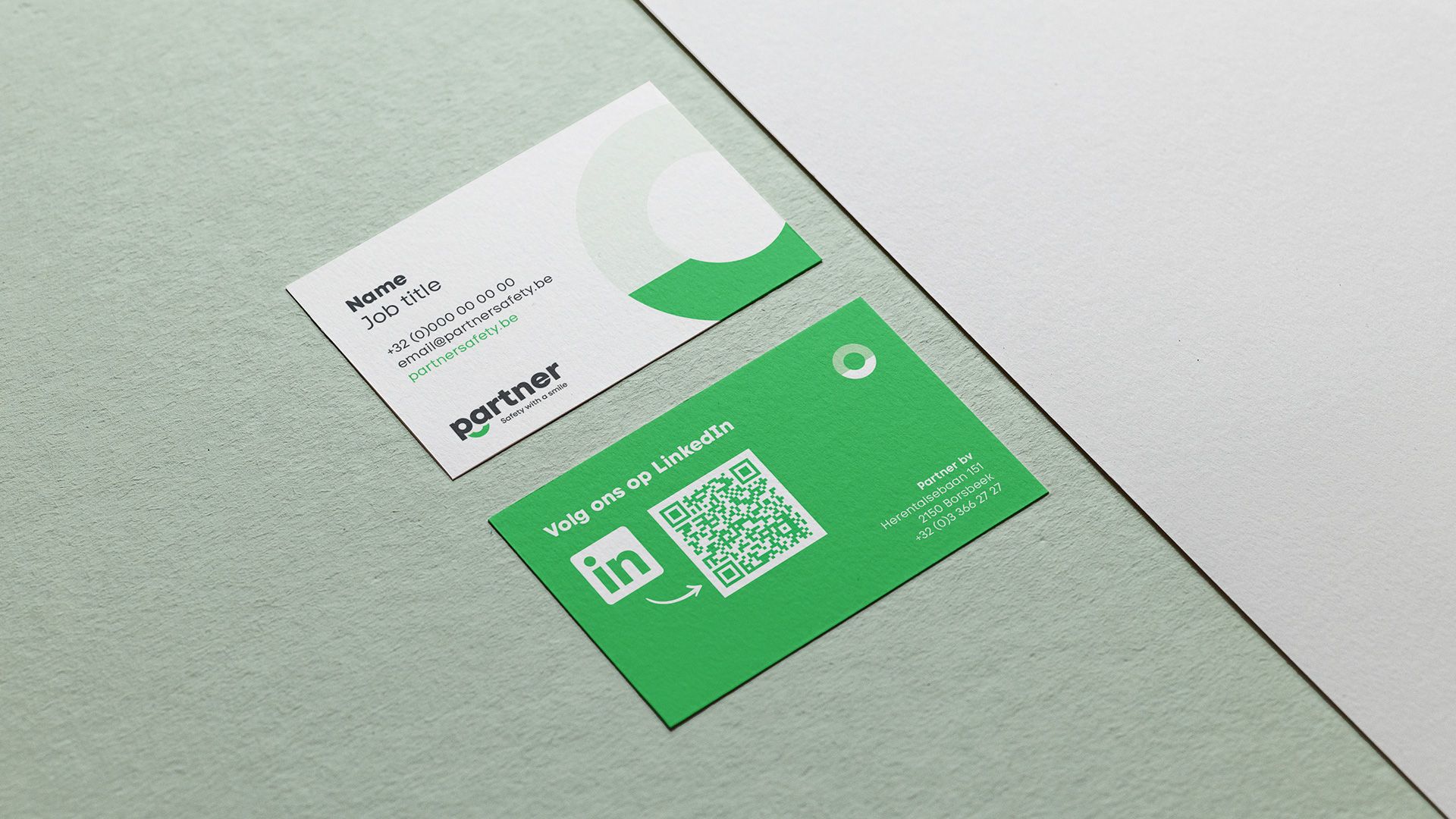
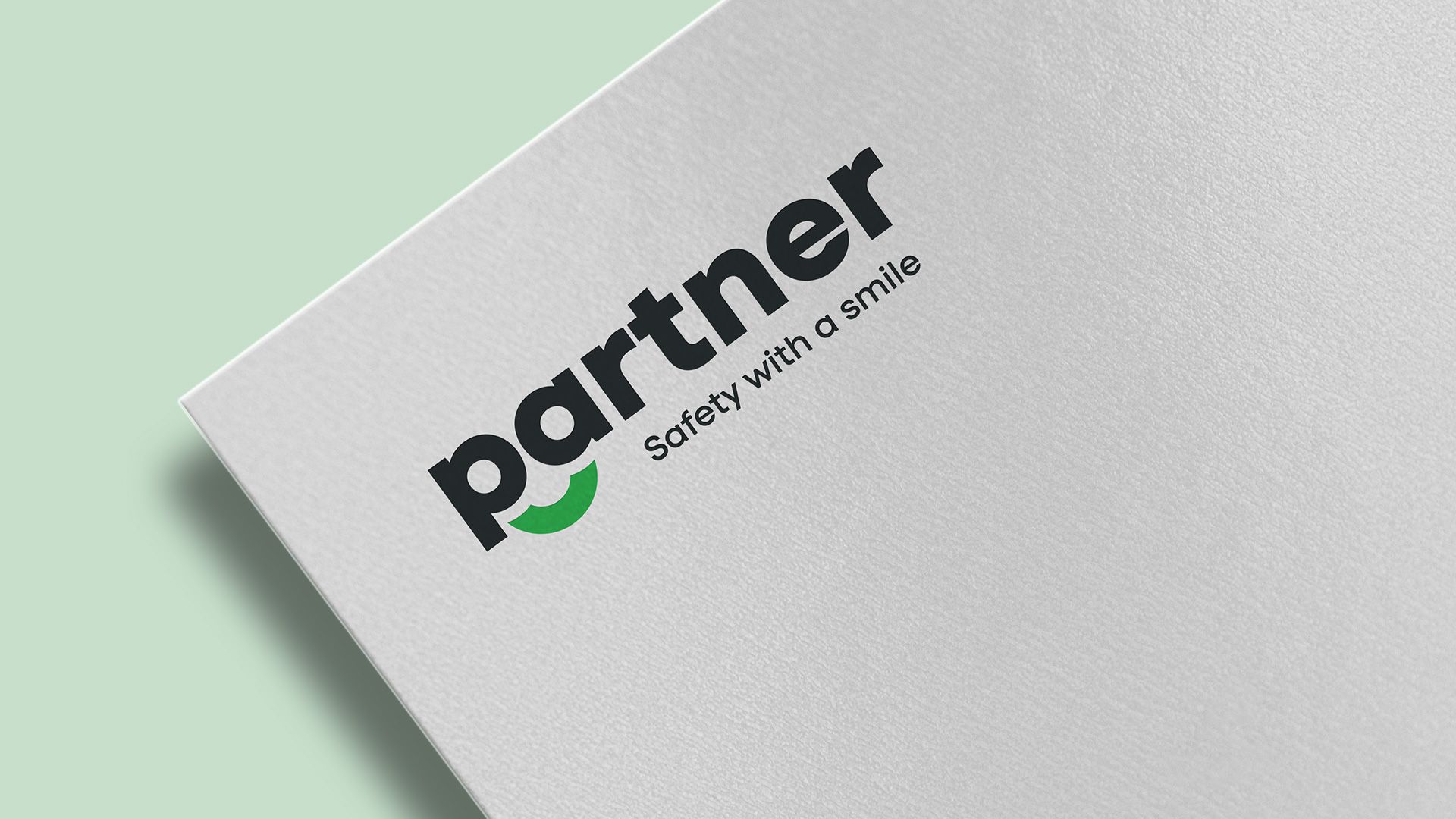
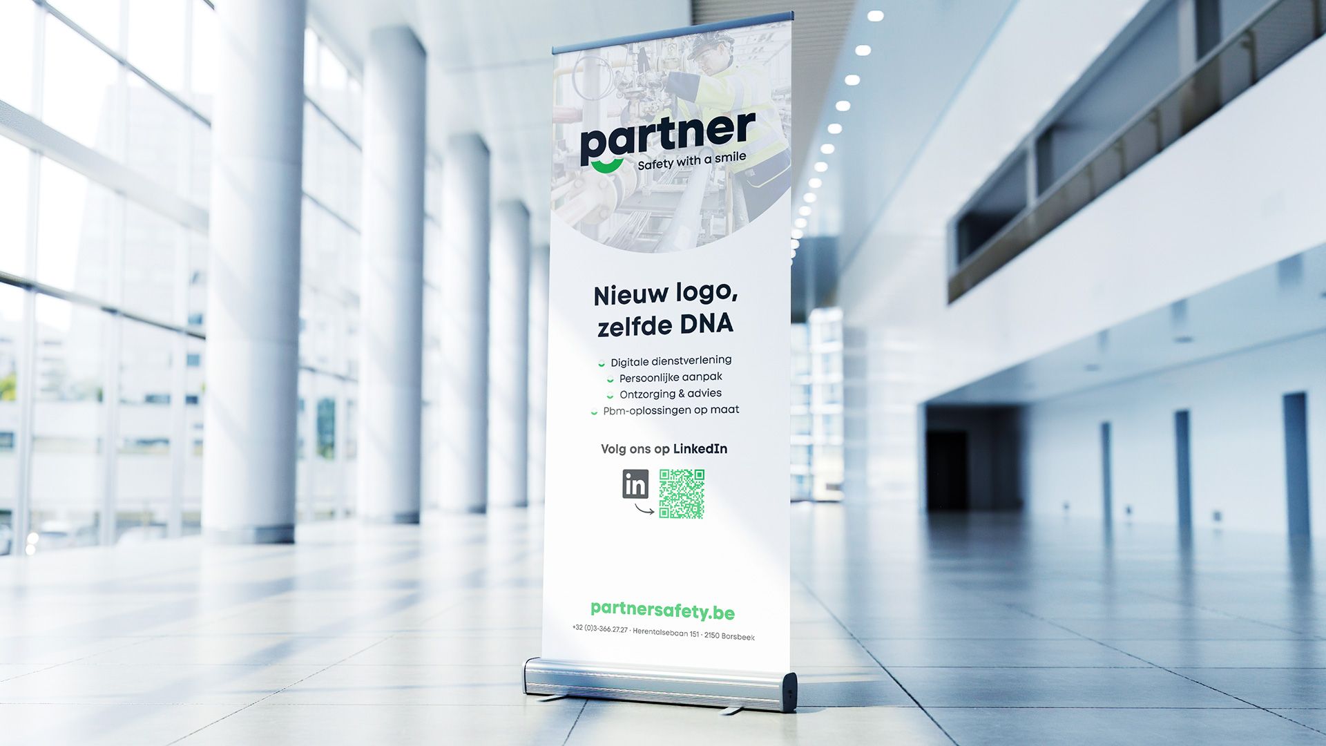
We started with the logo. The final design is clean, modern, and instantly recognizable. Bold typography communicates strength, stability, and expertise - key values in the world of safety equipment. At the same time, we introduced a subtle smiley element, adding a human touch that reflects the family-driven nature of the business and the close relationships Partner Safety builds with its clients. Everything comes together under the tagline “Safety with a smile”, reinforcing the idea that safety and approachability can go hand in hand.
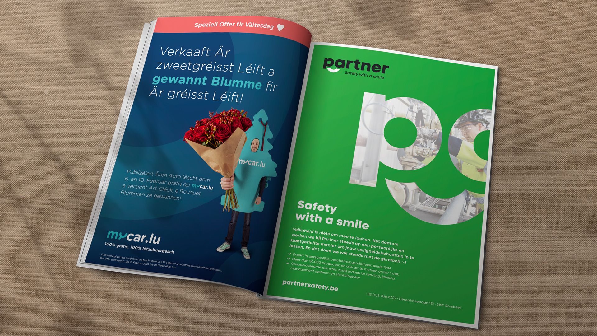
From there, we expanded the visual identity into a complete branding toolkit. We developed clear brand guidelines to ensure consistency across all touchpoints, along with stationery designs that carry the same confident yet friendly look and feel. To support Partner Safety’s visibility and growth, we also created flexible templates for promotional materials, including print advertisements and roll-up banners - ready to be used across events, on-site visits, and marketing campaigns.
The result is a cohesive brand identity that feels strong, trustworthy, and human. A visual foundation that supports Partner Safety’s mission, reflects their values, and helps them stand out in a sector where clarity and confidence matter most.
What we did
-
 See preview
 -
 See preview
 -
 See preview
 -
 See preview


Let's Talk .
Got a bold idea, a challenge to solve, or just curious what we could build together? Drop us a line. We’re always up for a good conversation - and even better collaborations.
© 2026 Ucan Communications